Consolidate as a reference in your industry
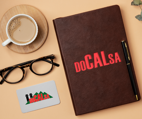
With more than 30 years in calcium extraction, this mining company entrusted us with the renewal of its brand image. We designed a modern and distinctive branding that reflects its trajectory and professionalism, strengthening its presence in a competitive sector and consolidating its position as a reference in the industry.
Reto y solución
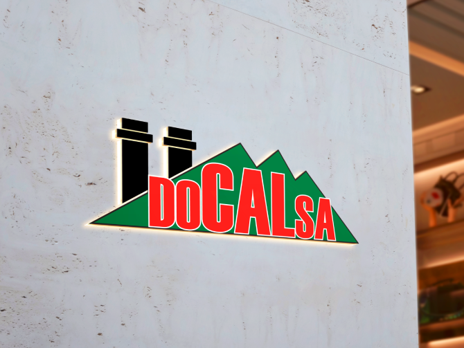
The mining company, with over 30 years in the market, faced the challenge of having an undefined brand identity. They lacked established corporate colors and wanted to incorporate a mountain into their logo to symbolize their connection to calcium extraction. The challenge was to create a branding strategy that captured their history, professionalism, and leadership in the industry, helping them stand out in a competitive market.
We developed a comprehensive branding strategy, starting with the creation of a distinctive logo that incorporated the mountain as a central element to represent strength and connection to their industry. We carefully selected a natural and professional color palette that reflects their commitment to quality and sustainability. The result was a modern and cohesive visual identity that highlights their experience and positions the company as a solid reference in the mining sector.
- Identidad de marca
- Sistema visual
- Materiales de marca
Resultado final
La entrega le da a DOCALSA una solución enfocada en identidad de marca, apoyada por Identidad de marca, Sistema visual y Materiales de marca, mejorando la experiencia digital de sus usuarios y dando al negocio una plataforma más sólida para operar y crecer.
Este proyecto fue realizado en colaboración con DevCreativo y se incluye como parte del portafolio profesional de trabajos completados como parte del equipo de DevCreativo.